Human color psychology industry uses
Do colors really exist or not? Even more mysteriously chaos theory behind that? As humans what do we see as color? Your yellow is not my yellow! And ultimately all uniqueness contributes to simple color psychological defines we all believe.
I come up with a simple objection for you before jam your calm mind. I would like to dress up as luxury and erotic random hospital staff and whole brand style in all black color. What is wrong? You are the patient and one of your needs is a keyword called luxury.
Now you have a right to have an argument about any color that has positive or negative psychological definition, meaning or social and cultural beliefs. We both are right! But I still play another role of color psychology.
I would like to smudge the positive and negative rule from two state of toggle choice to some sort of mixed belief. Later, dig into the core topics.
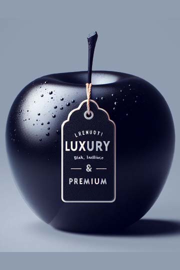
According to the colorpsychology.org traits of black color exactly as below,
The positive traits of black include protection and comfort, as well as, strong, contained, formal, sophisticated, seductive, mysterious, endings and beginnings. With negative traits being aloof, depressing, pessimistic, secretive, and withholding.
,
But I would like to add the luxury as positive psychological meaning for the black color am I wrong? No, according to the many online sources that is right. But why does the human brain analyze color psychology more situation based. or are we just blindly following the mass society? What is mass society? I can’t forget about the culture. What is the culture? What is human psychology and behaviors, how brands use them to divert traffic and ultimately convert them to money machines, we need to have an open dialogue more than what you and I see the whole world.
If the human brain analyzes colors with situations above two option toggle choice might be a right answer but how we are approach to that answer that’s again the mass group of choice dominate the minority.
But still, I would like to mix the traditional choice of answer with some odd instance. With the above hospital instance, I wish to apply a name that a just a hospital. I will call it as Near-Death Luxury Hospitals. Now we have a name, color few more steps ahead to the complete brand style guideline. But remind above traits. I would say, I will pick some random keywords suitable for my project. Luxury for it’s have grand service for patients, strong because it is facilitated with confidence with medical services, comfort and formal and finally, it’s USP (Unique selling proposition) would be the mysterious service for a very rare percentage of hospital patients will like or maybe just temporary pump sake for another viral attempt.
But with a traditional marketing mind set you might reply with four words of sentence, that will won’t work
.
But why? mass society would like to refuse untold message. From either brand or from an individual? Is that Bandwagon effect or Conformity mixed with post effect of cultural.
Conclusion of this instance would mass society would like to believe ambiguous choice of simple definite without open dialogue. What would say what would not say and what you get from a visual message.
Drug cartels would love to play with colors, According to Vice media YouTube channel I was found some sort of curious video title called “The Pink “Cocaine” Wave | High Society” from twenty-two and thirty-five minutes of whole video noted one special dialog called The Pink color seems harmless
very clever point of marketing strategy. One thing summarized, common factor for even any type of industry, business can perfectly hide out how much business model is horrific, disaster or even totally opposite. When the whole society believes in one single majority of choice, when doing opposite makes much more rabbit holes for being successful.
Conclusion, avoid majority of choice when will seem work.
That is how industries wipe off their own mud using your own choice of selection.
Black inking logos, you must never ever hear that word, that’s my new term for more popular and powerful brands getting monochromatic logos. Getting monochromatic remains less color options because brands don’t want to stick on to specific frame.
The color black is mostly remaining monochromatic choice when the brand moves towards the same set of strategies previously followed. Many tech device brands decided to get the benefit of color black for more than just monochromatic. When a brand achieves a great brand position and not much need to rely on mainstream colorful competition and plan to be unique from vivid colors as a premium label.
Brands will make it for humans. No matter how artificial intelligence solutions manipulate human choices for success on this ground anyone must pioneer as a human for human choices and preferences over competitors.
After human biology of Influence Color Perception and Why We Prefer Certain Colors, in here, I was discovered amazing knowledge combined from multiples factors for paint the bigger picture what you are experiencing currently but you don’t know right now. Remember the first question at the beginning. What are my main key points after all. Physics behind the colors, how designers use colors and finally bio medical professionals' perspective of human color psychology.
For a good approach I will start with the statement from psychologytoday.com article written by doctor R. Douglas Fields who neuroscientist and author of “Electric Brain” book. working at UC San Diego, Stanford University, Yale University, and the National Institutes of Health.
They tested the theory that human color preference is adaptive; that is, people are more likely to survive and reproduce successfully if they are attracted to objects with colors that "look good" to them, and they will avoid objects with colors that "look bad" to them.
- From the article.
According to a human participant test studied paper back in year 2010 by Palmer and Schloss known as “An ecological valence theory of human color preference”, 48 participants asked to rate 32 colors. However, summarized of above test proof over and over color visual weight chart believe by me. Heavy to low Red, Blue, Green, Orange, Yellow. But this color weight categorization is subject to color weight when only change the hue and keep remaining size relative other objects. Above test subjected to flavored test, compare results with visual weight chart shows similar behavior.
Human perception of color psychology is adaptive to community groups such as target audience categorizations, biological and chronological factors as common conclusion but in advanced functioning it depends on an individual level of perception what them believe, humans are always take choices on bias, like recall your own cash memory without deep scanning to way beyond than the atomic level of every object around us even tangible or not. Also, I would like to comment my own words to whole process of human color recognition not alone at biological level that is combination of perceptional beliefs as unawares process.
This mistake makes the biggest vulnerability for manipulating mass society with color psychology at any production level.